Visualizing Noise pollution in New York City
Where, What, and When?
By Choi Dongon
Introduction
 source - https://commons.wikimedia.org. Lisence of this image is free to noncommercial reuse.
Noise pollution is the one of serious problems especially in metropolitan areas such as New York City. Noise has a negative impact on dwellers’ well-being lives. Also much scientific evidence shows that noise pollution has a direct health effect (Dominici, 2013, and WHO, 2011). Thus, noise needs to be considered the one of serious problems we have been going through. In this project, we will investigate noise pollution problems in New York City by visualizing and analyzing NYC311 Service Request data.
Materials and methods
Data source: NYC311 Service Requests
NYC311 Service Requests provides support to people in New York City by providing a service at any time, all year round, which is collecting requests for a variety of governmental services, such as filing a noise complaint.
The data used in this project is NYC311 Service Requests data in 2016. Each observation contains 53 variables describing the detailed information on each the service request, such as complaint type, date received, incident location, and description of complaint. In order to lessen computational overhead, in this project, only several columns will be used. I will visualize and analyze the data to answer the following three basic questions on noise pollution in New York City in 2016:
- WHERE: Where does noise pollution occur?
- WHAT: What are contributable factors?
- WHEN: When does noise pollution take place?
To answer these questions, several tasks need to be done. It includes from a basic data handing to setting up for visualization.
Data preparation
Load any required packages. You might need to install some packages by typing ‘install.packages(“PACKAGE”)’
## Load any required packages
library(dplyr)
library(tidyr)
library(ggplot2)
library(ggmap)
library(openair)
library(scales)
library(gridExtra)
library(DT)
The data used in this project is available at NYC Opean data website. We can download this data from this link. Due to the size of this data, I will load directly from my own computer after downloading the data. After loading the data, we need to filter out some columns to reduce computational overhead, and handle this data for visualization.
## Load NYC 311 noise complaints data
noise <- read.csv('data/NYC_noise_2016_1.csv', stringsAsFactors = F) %>%
  tbl_df()
## Filter NYC 311 dataRemove missing data
noise <- filter(noise, !is.na(Latitude) | !is.na(Longitude)) %>%
  select(Created.Date, Complaint.Type, Borough, Latitude, Longitude)
Let’s look at the data sample. After filtering, the data has five columns which contain noise information on incident date, type of complaint, region and location(lon, lat) where it took place respectively.
## Data Sample
datatable(head(noise), options = list(searching = T, pageLength = 5))
We need to convert date format of Created.Date to ’POSIXlt’to handle date information properly. Also the values on location(both Latitude and Longitude) need to be rounded to 3 decimals to conduct a density calculation.
## Convert values on Created.Date to POSIXlt object for using date elements
noise$Created.Date <- as.POSIXlt(noise$Created.Date, "%m/%d/%Y", tz = 'EST')
## Create date fields to be used for time series analysis
noise <- mutate(noise, year = noise$Created.Date$year + 1900, month = noise$Created.Date$mon + 1, day = noise$Created.Date$mday)
## Round lat/lon to 3 decimals, to allow for density calculation based on location
noise <- mutate(noise, lat = signif(noise$Latitude, 5), lon = signif(noise$Longitude, 5))
The following tasks need to be done for mapping noise pollution by borough. This part includes downloading base maps of each borough and dividing raw data by borough.
## Set Longitude and Latitude of each borough
## By doing this, we can aviod OVER_QUERY_LIMIT error when use 'get_googlemap' function
Manhattan <- c("lon" = -73.97125, "lat" = 40.78306)
Bronx <- c("lon" = -73.86483, "lat" = 40.84478)
Brooklyn <- c("lon" = -73.94416, "lat" = 40.67818)
Queens <- c("lon" = -73.79485,"lat" = 40.72822)
StatenIsland <- c("lon" = -74.1502,"lat" = 40.57953)

## Download New York City map by borough from Google Map
manhMap <- get_googlemap(Manhattan, maptype = 'roadmap', style = mapstyle, zoom = 12)
bronMap <- get_googlemap(Bronx, maptype = 'roadmap', style = mapstyle, zoom = 12)
brooMap <- get_googlemap(Brooklyn, maptype = 'roadmap', style = mapstyle, zoom = 12)
queeMap <- get_googlemap(Queens, maptype = 'roadmap', style = mapstyle, zoom = 12)
statMap <- get_googlemap(StatenIsland, maptype = 'roadmap', style = mapstyle, zoom = 12)

## Prepare to map distribution of noise by borough
## For Manhattan
inmanh <- group_by(select(noise, -Created.Date), Borough, year) %>%
  subset(Borough=='MANHATTAN') %>%
  group_by(year)
## For Brooklyn
inbroo <- group_by(select(noise, -Created.Date), Borough, year) %>%
  subset(Borough=='BROOKLYN') %>%
  group_by(year)
## For Bronx
inbron <- group_by(select(noise, -Created.Date), Borough, year) %>%
  subset(Borough=='BRONX') %>%
  group_by(year)
## For Queens
inquee <- group_by(select(noise, -Created.Date), Borough, year) %>%
  subset(Borough=='QUEENS') %>%
  group_by(year)
## For Staten Island
instat <- group_by(select(noise, -Created.Date), Borough, year) %>%
  subset(Borough=='STATEN ISLAND') %>%
  group_by(year)
Noise pollution is visualized with ‘stat_density2d’ function provided from ggplot2 package. This ‘stat_density2d’ function is to do 2D kernel density estimation. Each created ggmap for noise pollution by borough is stored as a data.frame (mp1, mp2, mp3, mp4, mp5) in order to display more properly with ‘grid.arrange’ function in Result section.
## Set up ggmap to map distribution of noise by borough
mp1 <- ggmap(manhMap) +
  stat_density2d(aes(x=lon, y=lat, fill='red', alpha=..level.., size=0), data=inmanh, geom = 'polygon') +
  facet_wrap(~ Borough) +
  theme(axis.ticks = element_blank(), axis.text.x = element_blank(), axis.text.y = element_blank(), legend.position = 'none') +
  xlab("") + ylab("")
mp2 <- ggmap(brooMap) +
  stat_density2d(aes(x=lon, y=lat, fill='red', alpha=..level.., size=0), data=inbroo, geom = 'polygon') +
  facet_wrap(~ Borough) +
  theme(axis.ticks = element_blank(), axis.text.x = element_blank(), axis.text.y = element_blank(), legend.position = 'none') +
  xlab("") + ylab("")
mp3 <- ggmap(bronMap) +
  stat_density2d(aes(x=lon, y=lat, fill='red', alpha=..level.., size=0), data=inbron, geom = 'polygon') +
  facet_wrap(~ Borough) +
  theme(axis.ticks = element_blank(), axis.text.x = element_blank(), axis.text.y = element_blank(), legend.position = 'none') +
  xlab("") + ylab("")
mp4 <- ggmap(queeMap) +
  stat_density2d(aes(x=lon, y=lat, fill='red', alpha=..level.., size=0), data=inquee, geom = 'polygon') +
  facet_wrap(~ Borough) +
  theme(axis.ticks = element_blank(), axis.text.x = element_blank(), axis.text.y = element_blank(), legend.position = 'none') +
  xlab("") + ylab("")
mp5 <- ggmap(statMap) +
  stat_density2d(aes(x=lon, y=lat, fill='red', alpha=..level.., size=0), data=instat, geom = 'polygon') +
  facet_wrap(~ Borough) +
  theme(axis.ticks = element_blank(), axis.text.x = element_blank(), axis.text.y = element_blank(), legend.position = 'none') +
  xlab("") + ylab("")
To plot the distribution of noise pollution by noise type, we need to make new data.frame from raw data.
## Prepare to plot distribution of noise type
bynoisetype <- group_by(select(noise, -Created.Date), Complaint.Type, year) %>%
  summarise(count = n()) %>%
  group_by(year) %>%
  mutate(percent = count / sum(count)*100)
To create a calander heat map, we need to load raw data and modify it.
## Set up data for date analysis
## Load raw dataset for date analysis
noisedf <- read.csv('data/NYC_noise_2016_1.csv', stringsAsFactors = F) %>%
  filter(!is.na(Created.Date)) %>%
  select(-Location)
## Prepare to plot calander heat map
caldata <- select(noisedf, Created.Date, Unique.Key) %>%
  mutate(Created.Date = as.character(Created.Date), Created.Date = substr(Created.Date, 0, 10)) %>%
  group_by(Created.Date) %>%
  summarise(count = n())
names(caldata)[1] <- "date"
caldata$date <- as.POSIXct(caldata$date, "%m/%d/%Y", tz = "EST")
Results
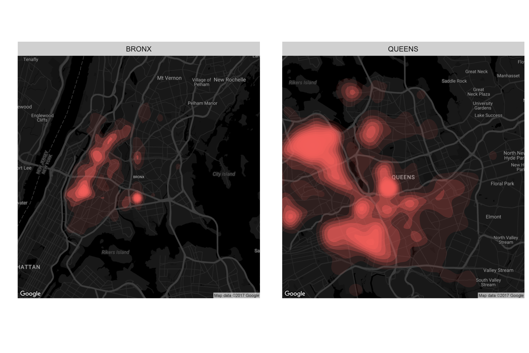
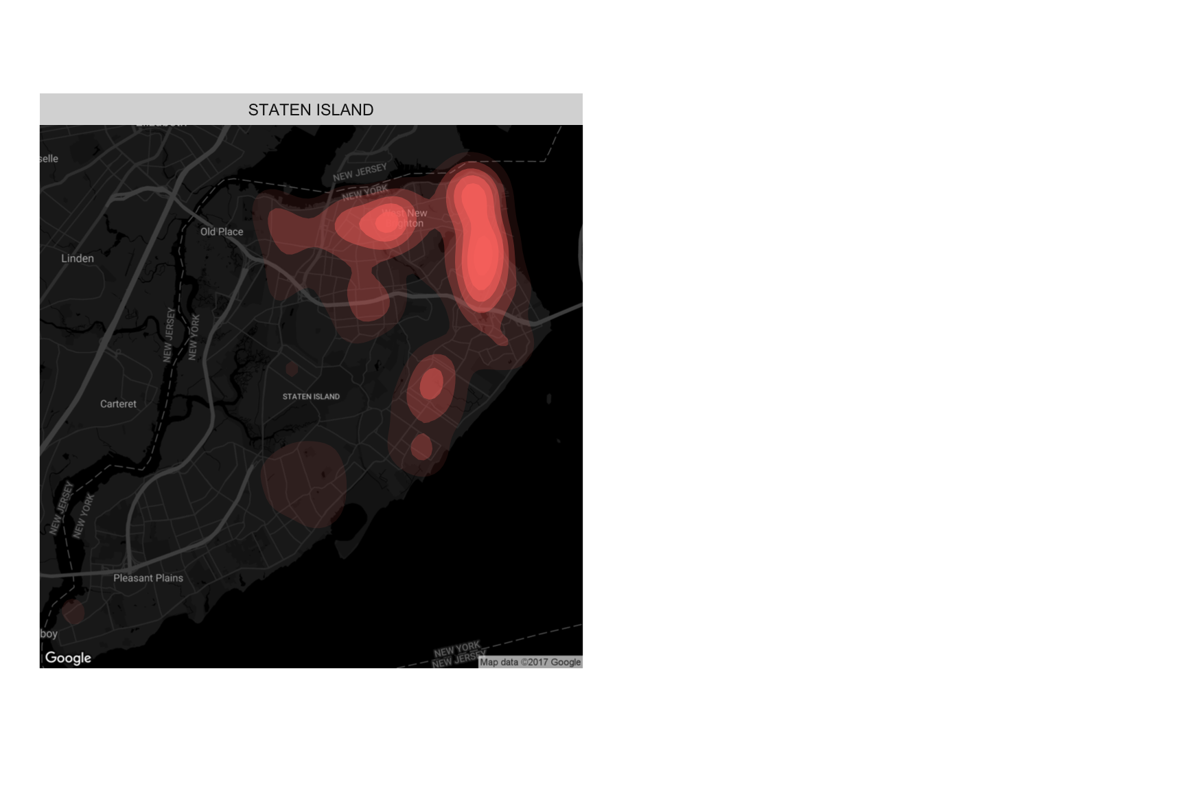
WHERE: Noise pollution by Borough
The following maps show the spatial distribution of noise pollution by each borough. New York City has five boroughs, which are Manhattan, Brooklyn, Queens, Bronx, and Staten Island. It would be more intuitive to disply these maps at a single page using a ‘grid.arrange’ funciton.
## Map noise pollution by borough
grid.arrange(mp1, mp2, mp3, mp4, mp5, ncol = 2)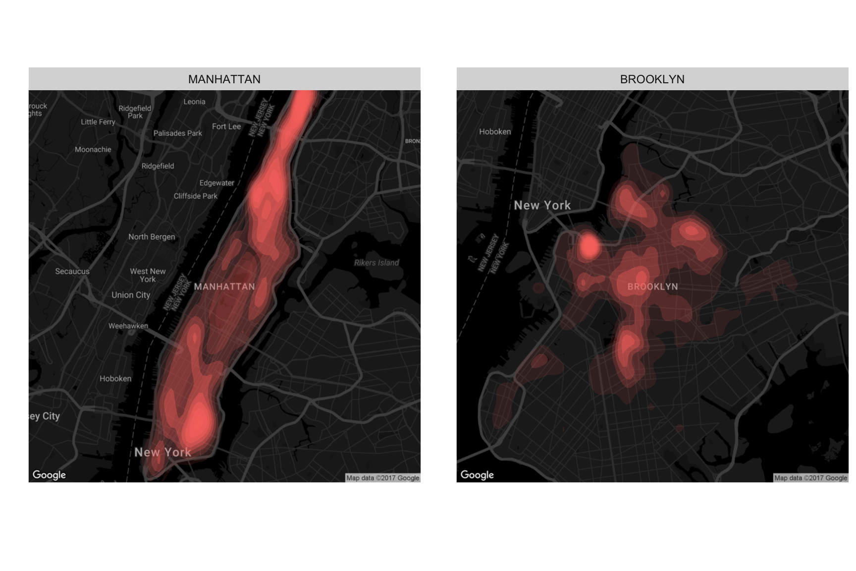
WHAT: Noise pollution by Type
Below plot illustrates the distribution of noise pollution by noise type. We can find the source of noise pollution in New York City.
## Plot distribution of noise pollution by type
ggplot(bynoisetype, aes(x=reorder(Complaint.Type, count), y=count, fill=Complaint.Type))+
  geom_bar(stat = 'identity') +
  coord_flip() +
  ggtitle('Distribution of Noise Type') +
  xlab("Percent of Complains") + ylab('Types of Noise') +
  scale_y_continuous(labels=comma) +
  theme_bw() +
  geom_text(aes(label = paste0(round(bynoisetype$percent,2),"%")), nudge_y=2)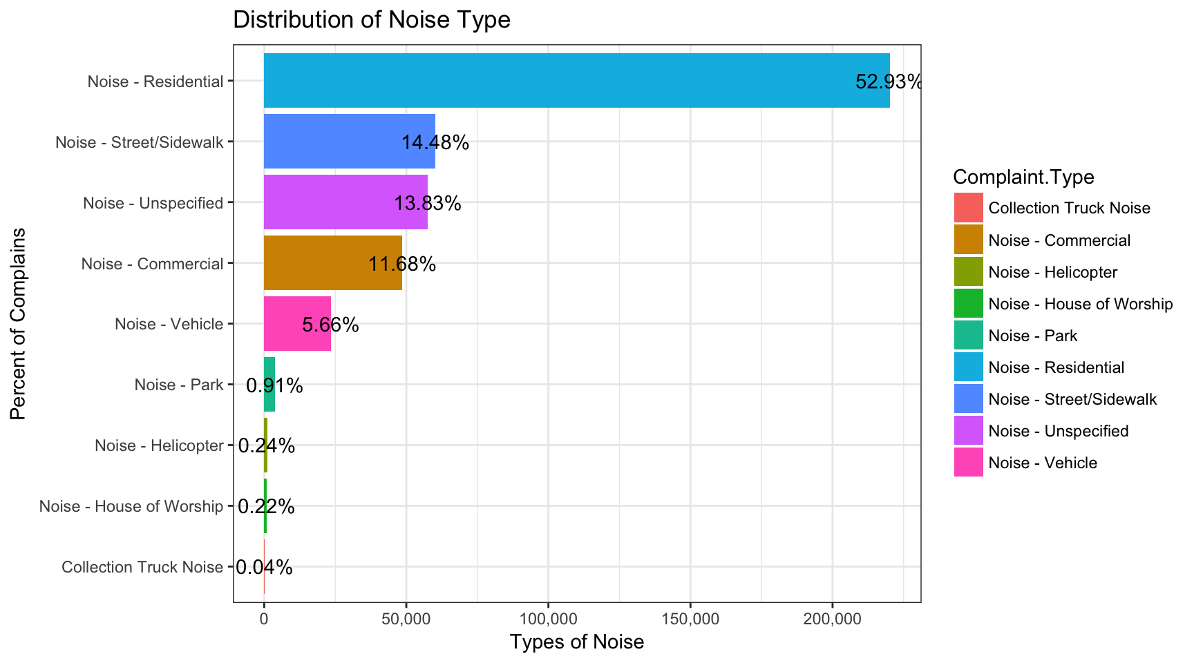
WHEN: Noise pollution by Date
The following calender map illustrates noise pollution by each day in 2016. By using a ‘calendarPlot’ function, we can creat a calendar heat map. Through this heat map, we can esaily look over the frequency of noise pollution by each day.
## Plot a calendar heat map on Noise pollution by date
calendarPlot(caldata, pollutant = "count", year = 2016, main = "Noise pollution by Date in 2016", cols=c('yellow','orange','red'))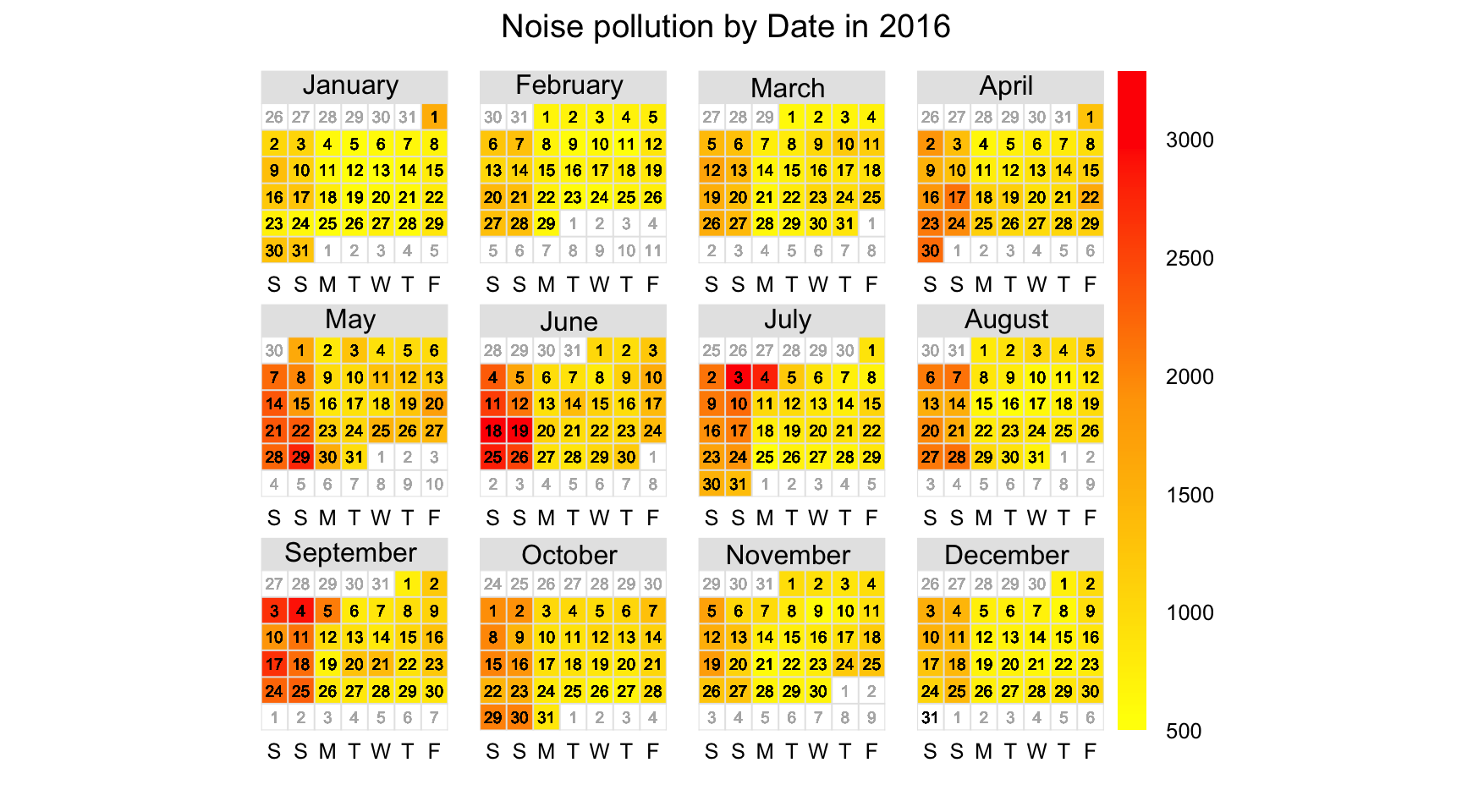
Conclusions
In this project, noise pollution in New York City is investigated based on three basic questions - Where, What, and When.
WHERE: For Manhattan and Queens, noise pollution is distributed almost the whole of each borough. On the other hand, for Brookyn and Staten Island, noise pollution is distributed in northern areas of those boroughs. For Bronx, noise pollution is distributed in southern area.
WHAT: The most contributable factor to noise pollution in New York City is residential noise (about 53%). Other major factors are coming from street/sidewalk (about 14%), unspecified sources (about 14%), and commercial (about 12%).
WHEN: When we looked at calander heat map, noise pollution primarily occurs during the weekend. It might be because many people invite friends to their houses and have a party with playing a music, making some serious noise.
We’ve looked at several visualizations on noise pollution in New York City in 2016. Through this project, we can see the characteristics of noise pollution in New York City and it allows to understand noise pollution in New York City with mutiple perspectives.
If possible, it would be interesting conduct the following research: - Examine noise pollution at hourly scale - Make interactive and dynamic noise pollution map - Examine spatial relationship noise pollution and heart disease
References
Dominici, 2013, Residential exposure to aircraft noise and hospital admissions for cardiovascular diseases: multi-airport retrospective study, British Medical Journal.
NYC Open Data - https://opendata.cityofnewyork.us/
NYC Data Science Academy Blog - https://nycdatascience.com/blog/
WHO, 2011, Burden of Disease from Environmental Noise.